Showing posts with label Layering Squares. Show all posts

Sunday, 2 August 2020

#CTC279 CASE the Sketch on Page 72


This is the card we are CASEing this week:


And this is the card translated to a sketch to help you in your planning. We hope you'll play along and post your card to our Facebook page by next Sunday evening using the link over to the right.

I've opted for a monotone card - white on white - except for the greeting. I've used a thick Whisper White cardstock base. I've cut a mat and trimmed it to 1/3 and 2/3, running the small piece through my machine with the Pinewood Planks 3D folder and the larger piece with the Ornate Floral 3D folder. I adhered them to a scrap of cardstock to hold them while I wrapped a piece of Baker's Twine around the card then added it to my base. 

Next I used Layering Squares to cut my square and the scalloped background. I embossed the plain square with the Old World Paper 3D embossing folder and glued it to the backing scallop. My greeting is from Zany Zebras and stamped onto Whisper White card then adhered to a piece of black cardstock with had been diecut using one of the Ornate Borders dies. This was then popped under the scallop and the whole section was added using Stampin' Dimensionals.

I've used Poppy Moments dies to cut the poppy background from Vellum cardstock and the outline and stamens from Whisper White before adhering them all together (just in the centre), and gluing to the embossed square. I've added a Baker's Twine bow to finish.


Please continue on the hop to Shannon's adorable card:


Sunday, 1 July 2018

#CTC185 - Best Route


We're CASEing from pages 52-65 this week!


For me it was page 52 itself - did you notice these folders on the right hand side of the large picture?

That was my inspiration!. Even though I don't (yet!) own this set of DSP (Designer Series Paper), I liked the combination of the Blueberry Bushel and Mango Melody and created my own.  I've also chosen to CASE the layout of two of the folders as well. Both cards have Crumb Cake cardstock for the base.  


The left sample has a Blueberry Bushel banner embossed with Layered Leaves 3D TIEF and the top strip was the DSP I created using strips of Mango Melody cardstock attached to Whisper White and then lines were drawn by hand with a black marker pen. A silver foil plate made using the Layering Squares framelits was popped over the bird image and greeting from Hedgehugs.  


The right hand card has a banner of  DSP created using Handwritten stamped in Blueberry Bushel with the mushroom image from Hedgehugs randomly stamped in Mango Melody. The Blueberry Bushel strip was added after having a Hedgehugs flower image self stamped with Blueberry Bushel ink, then Hedgehugs again provided a greeting and image which was placed under another silver foil plate. Relatively quick and easy, but more so if you actually have the DSP! Check with your Demonstrator about the special "Buy 3 Get 1 free" offer for July!


Feel free to join us and make a card then post using the link over on the right.  Meantime, please pop in and see what our lovely friend Angela has lined up for us this week...

Thursday, 22 June 2017

CASEing the Catty - #CTC133 Love and Sympathy

Two posts in one day, but don't get used to it!  This time, I'm CASEing page 89. Notice the little tips throughout the catalogue? There are loads of them, go have a hunt and see how helpful they are to you.

I've chosen to use the daisy from Daisy Delight and the greeting from the same set. Very Vanilla and Copper look sooo good together.  I've based my layout on the card but chose to stay with the copper theme, and used the layering squares to cut the scallops from Copper Foil for my mat.  I raised the greeting and popped some Copper metallic thread behind.  So effective, and yet so simple.  One little tip, as the daisy image needs to be stamped twice, if you stamp into the Versamark and then into an ink pad, you can see where the image is to line up the next stamp - ask me how I know it can be very hard to see versamark before the embossing powder is added!!


Below is a photo with a light turned on to show how the embossing and copper really pop


Wednesday, 17 May 2017

Masculine Themed International Blog Highlight

Another month and and another International Blog Highlight put together by Kylie Bertucci, where global entries are accepted and then voted on with the Top 10 featuring in a Blog Hop.


This theme lead me in the direction of an upcoming birthday card I needed to make, and my favourite go-to card for a 'Wow', the Tri-fold card.  Didn't remember how awkward these can be to photograph so apologies, and hope you get the idea.  Don't be put off if, it's not as hard as you think but if it isn't your thing, scroll through this post as I have a very quick and simple card with the same theme


This features a few more of my last hurrah's which I've been doing in my May posts.  Yes, sad to say The Wilderness Awaits and Wetlands are on the list, along with the 12"x12" Kraft cardstock, and previously mentioned Delightul Dijon cardstock and ink.  


My simple method of creating this card:  Cut base card of Kraft, 6" x 12", score at 2", 4" 8" and 10".  Rotate and line up at the 4 1/2" mark on your trimmer, cut from 1st score line to last score line, rotate 180 degrees and do this again (or 1 1/2" and 4 1/2" if that is easier). Then simply start at the first score and mountain fold, then valley fold. 2nd row, miss 1st score (hidden under the oval), then mountain and valley fold, and last row is same as 1st. From there my Early Espresso mats, are each 1/4" smaller than the measurement in kraft, and then the next layer of Whisper White, another 1/4" increment smaller again. I know it looks busy, but by keeping the layer of white crisp and choosing not to colour the images, I thought it masculine but not fussy.  The extra dimension stamped in Delightful Dijon is from Timeless Textures and the Large Numbers were cut in Delightful Dijon and Early Espresso, top layer embossed with the Hexagons Dynamic TIEF and coated with some Crystal Effects (now retired, but the Fine Tip Glue can be used as an alternative).  Folds up to fit in a normal envelope:

As promised, if you are feeling a little daunted, here's a quick card I put together featuring the same stamps sets, with a sneak peak of the new Wood Textures DSP stack, using the Layering Squares and Stitched Shapes framelits. Linen thread wrapped and tied off with a knot and the greeting from Wetlands die cut from another last hurrah, Tags and Labels framelits.

Thanks for staying to the end and don't forget to throw a vote my way!!  Regards, Sandra

Monday, 1 May 2017

Case the Designer - #GDP084

Decided I should try and play along now that I'm back from school break.  So this card was just the thing to ease back into my crafting, albeit a little last minute! Michelle Last was the designer, and I loved the simplistic but effective look.  I chose white on white, with the ping of Rich Razzleberry and Crushed Curry.  The flowers are from the Botannical Builder framelits and matching stampset which are sadly retiring so this is also the start of my last hurrahs. I used Petal Burst for the background embossing, and the Layering Squares for frame.  The greeting is from Beautiful You, and a few rhinestones - which although are retiring, are being reformatted and are apparently a flat design.  


Thanks for stopping by

Wednesday, 12 April 2017

Wedding Theme - International Blog Highlight

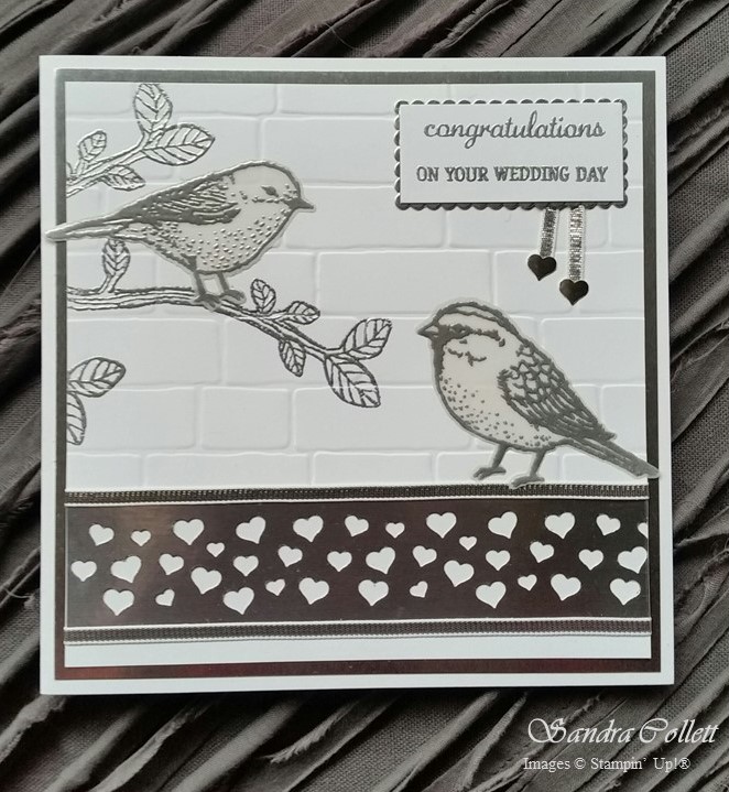
Kylie Bertucci has put together another International Blog Highlight where global entries are accepted and then voted on with the Top 10 featuring in a Blog Hop.  The theme this time round was Wedding and my take was to use just two colours - White and Silver.

I used Whisper White to make a 6" square base. The Silver Foil sheet was cut to 5 3/4" square and the top layer of Whisper White is 5 1/2" square.  There were a few things going on to get this card together. Firstly the heat embossing. I softened the birds by silver embossing on Vellum and die cutting. The leaves were heat embossed directly onto the top layer of the card, then gently dry embossed (lifting both tabs on Big Shot platform) with the Brick Wall TIEF. The greeting was embossed on a piece of scrap and cut to fit using the Layering Squares dies, matched with the silver foil for the scalloped mat. A strip of Silver Foil was punched with the soon to be retired Confetti Hearts Border punch and adhered to the bottom of the top layer. Silver 1/8" ribbon was added to the top and bottom of the punched strip as well as tails for the greeting.  Finished off with a couple of the little 'punch poo' hearts. Stamped images are all from Best Birds.


What I didn't account for, was how difficult it is to get a decent photo with silver foil!! I apologise for the quality but hope you get the idea.  Like what you see?...


If you are interested - I have kept the inside simple and along the same elegant lines.  I replicated the mat to give the card some structure and balance, and then just popped on a couple of little Silver Foil flowers die cut from the Bloomin' Heart Thinlits.


Sunday, 20 November 2016

Mediterranean Moments

A set that jumped out of the new catalogue at me was inspired by $Million sales achiever, Susan Nygaard.  We also saw Liz Collett demonstrate some great ideas using this set at #onstagelive. Of course, once I started, I wanted to use all my samples, and another item showcased here is the Stitched Shapes Framelits which have proven so popular they will not be able to be ordered after tomorrow due until sometime in the future, but they will be in the new catalogue in June.  

First up a card to satisfy the Global Design Project sketch challenge #gdp062.  I have gone monochrome, using only Soft Suede against Whisper White.  The spots on the Fancy Frost Specialty DSP were made using Soft Suede refill dropped into water, then dipping my aqua painter in and flicking lightly.  Of course, I couldn't waste the coloured water, so see below for what else I did.  The image was stamped then diecut with the oh so versatile Stitched Shape Framelits.  The sketch was landscape, but I have gone portrait, and hope it still fits the rules.  The greeting from Jar of Love has been layered onto Soft Suede which I also diecut from the same framelits, just a little bit of tweaking along the way...


Next up, a card for a friend who has just purchased her first home after a change in circumstances - I hope it makes her smile. Greeting again from Jar of Love and diecut with the Tags and Labels framelits, Bow from Pretty Pines Thinlits and a few rhinestones to finish.


Something calming about this picture, so again you don't need to to put much behind your card as the picture says it all. Image diecut from Stitched Shape Framelits and layered onto scallop from Layering Squares. Greeting from Jar of Love and just a couple of plain strips of Basic Black cardstock for the background. 


Most people think of the vibrant blues and reds (along with terracotta) when thinking of the Mediterranean, so this card was a bit of a play on that. I believe it is called Spotlighting Technique, and my spotlights were again diecut from the Stitched Shape Framelits.  My blue is Island Indigo backed with Real red.  Greeting - yes, you guessed it - Jar of Love.


The last card to show you was using the leftover water I referred to from the first photo.  I watercoloured a piece of Whisper White card, and thought the colour wasn't intense enough, so I just tipped all the water onto it.  Of course, that meant waiting for it to dry.  So I sped it up with the heatgun, and like how the ink started to separate so it had a soft yellow haze around the edge.  I stamped it with my image in Archival Black, then ran it through the Big Shot with Petal Burst TIEF, then I actually shifted it a smidge and ran it through again.  I layered that onto Basic Black and now have a fun no occasion card ready to send, or I could pop a greeting on when called for...


Here they are all together.  Hope you love this set as much as I do, although sorry that you have to wait until January to order it.

Thursday, 28 July 2016

And Kittens (of Course)...

They say you are either a dog lover or a cat lover, but in my case that is not true.  I'll take them both!  So for those of you who thought I was biased last week, I'm evening the score this week...  Again using some retired dsp, but that image on the left is just so fun!  And apt...  Life is Messy.  Check out the other images and greetings on pg 101 for Pretty Kitty.  The framelits I used  are from Tags & Labels (left) and Layering Squares (right).


They say you are either a dog lover or a cat lover, but in my case that is not true. I'll take them both! So for those of you who thought I was biased last week, I'm evening the score this week... Again using some retired dsp, but that image on the left is just so fun! And apt... Life is Messy. Check out the other images and greetings on pg 101 for Pretty Kitty. The framelits I used are from Tags & Labels (left) and Layering Squares (right).


Thursday, 9 June 2016

I Love Bumblebees!

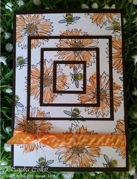
Yes, I have to admit - right up there with my butterfly addiction is my love of bumblebees.  (Always said if I got a tattoo it would be a bumblebee and it would be on my shoulder!) As soon as I saw this stamp - it went straight to the top of my wish list!  Can you believe it - 1 stamp from the set of 15 had me that easily. However, I must say - I think the rest of the set (Touches of Texture) is pretty good as well. This only arrived today and I had to have a play, check out what I did below.  I also used the new Layering Squares Framelits and the Peekaboo Peach ruched ribbon.  I used Early Espresso and Peekaboo Peach ink for the flowers and Memento Black for the bee coloured with a Hello Honey marker. Early Espresso cardstock for the main card and mats. When I decide what I will use it for, I'll attach a sentiment over the ribbon - until then, I'll just sit and admire it...