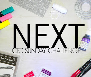
I can't wait to see how many varieties of this card we end up with. Remember you can case the layout, the theme, the colours - let your mind wander...
I pretty much stuck with the elements I saw - minus the metal element. I spun the card 180 degrees and used the new Pretty Peacock in-colour as my base card. I've teamed it up with a piece of DSP from Perennial Essence, although you probably can't see it has a tiny daisy among the water colour background and I've embossed it with the Subtles 3D folder. I chose to the same die to cut the little 'x's down the edge using Stitched Labels. I've stamped the stem from Daisy Lane in Granny Apple Green onto a Whisper White diecut from the Stitched Nested Labels. I've then stamped two Highland Heather small daisies from Daisy Lane and punched with the co-ordinating Medium Daisy Punch before adhering together. It has been added using a Stampin' Dimensional, as has the greeting from Butterfly Wishes, again stamped in Granny Apple Green, snipped and the edges inked as well.
I thought I'd finished off when I added the White Baker's Twine bow until I noticed a little blip in the cardstock. Rather than starting from scratch with time not on my side, I opted to attach another piece of Pretty Peacock cardstock which was run through the Subtles 3D folder, butted up to the DSP and wrapped to the back like a spine cover.
Thanks for stopping by. Please feel free to play along, and link your picture to our Facebook page with the link over on the right. Now please continue on the hop with the lovely Peta's cute creation:


Lovely daisy Sandra, and that DSP is a beautiful backdrop. I find "blips" in all sorts of places too!
ReplyDeleteThat DSP goes so nicely with the Pretty Peacock base and then the Highland Heather daisy picks up one of the other colours from the DSP. Great blending of colours between the elements.
ReplyDeleteBeautiful card Sandra, these colours work so well together. I love how you've fixed your "blip", very creative.
ReplyDeleteThat extra piece of yardstick is such a happy accident! It looks like a little notebook. Great CASE of the original card. I just love that DSP, it looks so dramatic even when only a little is showing.
ReplyDeleteCardstock not yardstick, lol!! Stupid autocorrect.
DeleteWow, Love the contrast between the sweet elegant daisy and the intense colours of the background! This is amazing. And that foldover the edge technique is a winner!!
ReplyDeleteLovely card, Sandra. I love how the DSP blends with the card base.
ReplyDeleteVery, very pretty in that subtle shade.
ReplyDelete